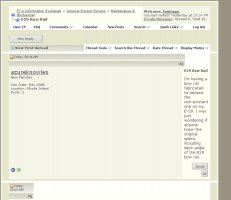
Personally I really like the Navy Blue with the cropped Gold Logo. I think it works much better than the old turquoise background. I like the warm gray background. Soothing to look at when you look at this site as much as I do.
IMHO,
-Professional Graphic Artist / Designer for over 30 years, but what do I know.

Thank you... I, an architect-in-training-trying-to-learn-aesthetic-senseabilities-from-artist/architect-friends, really appreciate the comment... I was trying to combat my stricter side so... You should see what some of my buildings are starting to look like now...
Now I need to find the switch for this pesky navy blue outline that has come up around all the frames of the forums..
//sse


 )
)