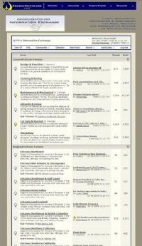
• Untitled Document

    Join us on March 29rd, 7pm EST

    for the CBEC Virtual Meeting

    All EYO members and followers are welcome to join the fun and get to know the guest speaker!

    See the link below for login credentials and join us!

    March Meeting Info

    (dismiss this notice by hitting 'X', upper right)

EY.o 2.0 - Upgrade & Bug Report

Status
Not open for further replies.

Sean Engle

Your Friendly Administrator
Administrator
Founder
Site Resources - Login Will Be Required

Under the new site, everyone who wishes to download docs will need to be logged into the Information Exchange. The galleries, projects, and links will also be under this new system.

Why? Well, because it's more helpful for us - more secure and gives us an idea of who's visiting, etc. (remember the hacking incident in 2004?). It also helps with respect to our being able to offer more stuff since it's not going out to the 'general public'.

The new site will also offer more in the way of regional stuff, images from rendezvous, ericson gear, etc. You can visit the new site and watch it's progress via the link below - although the Information Exchange you see won't have the new colors - you won't see that until we go live with it in a few months...:

www.ericsonyachts.org/home.php
 

Sean Engle

Your Friendly Administrator
Administrator
Founder
Excuse Our Dust!

Ok - summer quarter just ended, so I'll be balancing my time between house projects and the new version of the site.

If you see something that looks odd, my apologies in advance - but there will be a bit of that as I try and get this thing (version 2 of this site) wrapped up before fall quarter begins...

//sse
 

Sean Engle

Your Friendly Administrator
Administrator
Founder
Look Up the Term: "Upgrade"

Well, the server upgrade went ok yesterday - except the new version of BSD they're running won't support .php3 - which the menu system on the new site uses....so.....

I'll have to rebuild the menu system before work on the new site can continue...:oops:

//sse
 

Sean Engle

Your Friendly Administrator
Administrator
Founder
Rebuilt - Just in time for finals!

Here's some good news: After spending all day and night on Friday working on it, I've managed to completely rebuild the new menu system on the 2.0 version of the site. So...we're back to where we were before our host 'upgraded' our server (in September).

The new address of the 2.0 version of the site is:

http://www.ericsonyachts.org/home.php

:egrin:

//sse
 

Sean Engle

Your Friendly Administrator
Administrator
Founder
Version 2.0 On Line

I just turned it up :

EricsonYachts.org 2.0!

You may notice a number of things still left undone (Regional Pages, a few others, etc), however it is 'in the water' and reading for finishing out.

Take a look around and send me an email with any issues you see.

Thanks,
//sse
 

Sean Engle

Your Friendly Administrator
Administrator
Founder
Are You Seeing Colors??

When some of you get the chance, please advise me on issues you see in the new site (besides incomplete-unfinished pages, I mean).

You should be seeing a new color scheme everywhere (like the attached) and a complete menu system at the top - everyone got that?

//sse
 

Attachments

  • targetview.jpg
    targetview.jpg
    55.3 KB · Views: 135

Sean Engle

Your Friendly Administrator
Administrator
Founder
Yes, This was the 1st time that it came up, prior today it was the "old" version that popped up

Yeah, I'm finding out some things about vBulletin's Style Manager that I was unaware of before... You should be seeing everything in a tan color now - and no more of that old aqua blue color, etc....

The only app I've found that still pulls it up appears to be Safari...but I'm working on that now as well....

//sse
 

Sean Engle

Your Friendly Administrator
Administrator
Founder
Splash Page Graphic

At the very front of the site (www.EricsonYachts.org) there is a new splash page graphic - made with some new morphing software I found...

Thing is causing me headaches...too big...too slow and does not auto-forward the way it is supposed to...

I'll probably end up changing it - let me know if you guys see other issues, etc.

//sse
 

Cory B

Sustaining Member
Thank you!

Hey Sean,

Thanks for the hard work. I know how "fun" it is to make sure everything works in every platform/browser.

One minor cosmetic issue, with IE (latest) and Vista, the top menu bar is aligned all the way to the left, while the forum is centered. Probably some funky css thing.

But even worse, the viking helmet is truncated!!!! :)

Edit: It just seems to be the forum related pages that have the offset menu. The static pages seem to have it centered properly.

Heres a pic...
 

Attachments

  • eyo.jpg
    eyo.jpg
    39.4 KB · Views: 127
Last edited:

Sean Engle

Your Friendly Administrator
Administrator
Founder
Info Exchange Centering; Helmet Alignment

Hey Sean,

Thanks for the hard work. I know how "fun" it is to make sure everything works in every platform/browser.

One minor cosmetic issue, with IE (latest) and Vista, the top menu bar is aligned all the way to the left, while the forum is centered. Probably some funky css thing.

But even worse, the viking helmet is truncated!!!! :)

Edit: It just seems to be the forum related pages that have the offset menu. The static pages seem to have it centered properly.

Heres a pic...


Yeah, I know about the centering thing - that has to do with the styles templates in vBulletin also....that's being looked into right now...

The menu thing (with the helmet off center) is intentional (no rolling of eyes, please...:rolleyes:). We just felt that the helmet appears in so many places that to have it up there in a complete state would be redundant to some degree - so it was suggested to put it off center and in a different color, etc....

//sse
 

hodo

Member III
Hi Sean, what language is the info for the regional pages written in? It comes up in something weird... starts out " Gait aut luptat ".
I like the new format, you did good, I'll tilt a porter for you!
Harold, S/V Mischief :devil: Maker
 

Cory B

Sustaining Member
The menu thing (with the helmet off center) is intentional (no rolling of eyes, please...:rolleyes:).

Well, in that case it looks very modern and hip. :egrin:

And I don't think it would be a bad thing if you used the home/welcome as the front page instead of the morphing page.

Hodo- I think the gobbleygook you see is just filler text until someone has a chance to put in the real text. Either that or I need a new Universal Translator.
 
Last edited:

Sean Engle

Your Friendly Administrator
Administrator
Founder
Hi Sean, what language is the info for the regional pages written in? It comes up in something weird... starts out " Gait aut luptat ".
I like the new format, you did good, I'll tilt a porter for you!
Harold, S/V Mischief :devil: Maker

You've never heard of the 'ApplePieese' language before, Harold??

Actually, it's common place-holding text - used in most desktop publishing and website building software. Eventually it will be replaced with -real words-, honest! :egrin:

//sse
 

Sean Engle

Your Friendly Administrator
Administrator
Founder
Beautifully layout Sean! Nice to see it going live! Thank you again for all your hard efforts!

:egrin::cheers:

Jeff Asbury

Thanks Jeff -

I'm glad I had some free time to get this thing in the water. It will be much easier now to take care of adding images to the gallery and profiles and projects - as all I have to do is drop them into a folder, etc - and besides, the creation of the new site was stopping all work on the old one, etc...

//sse
 

Sean Engle

Your Friendly Administrator
Administrator
Founder
Regional Pages

Will take some work - and are still a work in progress right now. I need to correct some of the code on them that's making them hang in the menus, correct the content links within the pages themselves (the result of indecision in where to place them, their structure, etc)...

All of that will be done over the next few months...

//sse
 

Mark F

Contributing Partner
Blogs Author
Thanks Sean,

The site looks great! If I had to vote on the offset header/truncated helmet thing, I would vote for leaving it as is but in a slightly lighter blue... if I had to vote on it :).

Thanks so much for all your work - this is a wonderful place to hang out.
 

Jeff Asbury

Principal Partner
Personally I really like the Navy Blue with the cropped Gold Logo. I think it works much better than the old turquoise background. I like the warm gray background. Soothing to look at when you look at this site as much as I do.

IMHO,

-Professional Graphic Artist / Designer for over 30 years, but what do I know.

:devil:
 
Status
Not open for further replies.
Top